dinsdag 21 juni 2016

Trend: soft interior

Time for a trend update! We see a lot of soft & tactile items in the interior the last period... so time to show you some of the best examples of it. 
Interior is going through a soft period; colours are more pastels or merged down tones, fabrics are soft & fluffy and harsh materials like marble are also used as a print on fabrics, to give them a softer look.
As a reaction to the world around us getting harder & more technological, we seem to move toward a soft and tactile home. Interaction with touchscreens for a big part of the day, makes us long for soft tactile experiences at home. We want to run our fingers over a non-digital surface & feel again. We long for a sensory experience... materials that invite us to touch it. As Li Edelkoort said it "Super technology asks for super tactility'
Home is also the place you go to for shelter and find peace after a busy day. A place where we can relax and feel comfortable.

Maybe these are some reasons why the interior gets softer. Let's show you some good examples of this trend. 

Accessories
Rugs are back as a big part of the living room, making the floor look (& feel) softer, the acoustics better and add some colour to your interior. Also pillows are a popular accessory the last period. You can get them in every colour or design you like! All sorts of shapes are available as well :) Even wall hangings - in macrame style and woven ones- are hip again... who would have thought? But hey, these modern weavings are quite awesome!

top: colour carpets by Scholten & Baijings / Belinda Evans  Alchemy / middle: found on allroadsdesign com/ rugs usa / pillow by Alix Waline & Sabatina Leccia / bottom: found on Steph Bond-Hutkin Bondville / Desert Morning Weaving found on etsy

Furniture
These soft accessories have been popular for a while now, but we also see more and more soft furniture. Loungy sofa's and ultrasoft poufs...round edges and soft corners. And we also see them surprisingly often in soft pastel colours like pink. Moroso is one of the brands which has awesome soft furniture, some of them designed by Patricia Urquiola. A lot of her designs are soft & tactile... and very beautiful!

soft and fluffy pink sofa & a textile lamp / found on anthologymag.com
a soft couch, pastel rug & round tables / Binti home
pillows hanging over the frame of the sofa / found on designfiles-net

round furniture to soften the marble wall / found on amara
this leather chair as a soft appeal / found on design studio 210

fluffy fauteuils, soft colours & tactile textiles, this is the perfect soft interior! / found on dotandpop.com.au

round corners all the way / “Ottoman” by Scholten & Baijings for Moroso
tactile textiles & soft colours / found on Mahalolena Style Life

rounded corners & an ultra soft appeal / Patricia Urquiola for Moroso

soft sofa in a bold colour / Muuto

geometric but soft looking poufs in pastel gradients / issey miyake for moroso
soft and industrial at the same time / found at showhome.nl

fluid lines all around / Sag stool by Nendo for MDF Italia
soft earth tones & comfy furniture / styled by Alessandra Salaris and shot by Beppe Brancato for Home magazine

extremely fluffy & pink sofa :) / found on The Selby


Hotels
There are some hotels and restaurants who really have embraced the soft interior. One of them is Sketch in London. This old 18th century building in Mayfair London, houses a tea room, bar and two restaurants. Its interior is playful, theatrical, witty and colourful. They also have a gallery and pay a lot of attention to art. The tea room is a pink & velvet affair, creating a total experience when having a high tea there. Even the toilets are soft & round edged; they are shaped like huge eggs!

the tea room in Sketch London / found on the refinery 29
powder pink velvet chair at Sketch London - great contrast with the marble
huge egg shaped toilets at Sketch London / found on the londoner

Another place in London which has a lot of soft elements in their interior is the Mondrian Hotel. This lush interior has been designed by Tom Dixon's design research studio and has an elegant twist on a maritime theme. The hotel is a former office building on the south bank of the Thames and was designed by Warren Platner. The nautical theme got a retro-chic twist in the new design. A lot of the interior elements are rounded and have a soft appeal, although the materials used might be harsh sometimes. The bold colours used accentuate the shapes perfectly.

the hotel spa at Mondrian London / found on dezeen
soft pink seating & round brass tables / Studio Tom Dixon Mondrian London
velvet rounded sofa's & round brass tables / Studio Tom Dixon Mondrian London


Beds
We have also noticed that nowadays it is totally ok, or even stylish to shoot an unmade bed... for years this was considered messy, but now we want the interior pictures to look more like a real home. Still a more perfect & upscale variant of our own homes... but at least more real in a way. And hey, these beds look so soft & inviting... We quite get that it is stylish now :)

soft colours & loads of comfiness / found on planete-deco.fr
looks a bit messy but sooo comfy too! / photo by Jeroen van der Spek
a totally soft & comfy bedroom / found on amara


Hope we have inspired you to add some softness to your interior! If you want some more colour inspriration, check our post on pastel colours or our pinterest bord. We have a great article about coloured sofa's as well, some of them are pastel or soft as well. You can find it here. For more inspiration follow our pinterest board on this soft interior trend.


maandag 30 mei 2016

Moodboard: Small rose by Wiebren

It is a moody Monday today, so time for a new moodboard! Today we will show you how you can combine our blue-green vase with a raw but colourful (vintage) interior. We also give some tips on colour, texture and material combinations.
This vase is carved by hand, with an intricate pattern. It is nice to combine the vase with other patterned materials, for instance with carved wood (1) or wood with the bark still on it. The combination with plants with a particular pattern is also great! (2). A rough wall in subtle, powder colours (5) also make a strong combination. 
To make a contrast with the carved pattern you can combine this vase with smooth polished metals like brass, aluminium or copper. It looks great when these metals are frosted (3). 
The blue-green of the vase is an intense hue, which goes well with a lot of colours. Here we show you how lovely it is in combination with powder pink (4), emerald green, wood brown and a dash of golden yellow. 


With this moodboard we will show you how our vase combines great with a vintage inspired colourful interior. Think pink! For instance in the entrance hall (1) pink is a great colour to use, it will make you smile every time you enter your home! In combination with white walls, some yellow, orange & copper accents and some light grey it give a very fresh feel to your room. You can also choose for a more powdery pink hue (3) which gives a more classical feeling. This is also great with grey and white and gets stronger if you combine different pink hues with each other (ton-sur-ton)
You can also choose to combine the pink with grey-blue and old leather or wood. This combination of dark materials & light colours is very strong! (2). If you love wood, you can use it on your walls as well, layered in a pattern it looks so awesome! (5). Use plants to liven up your interior, big ones with distinctive leaves make a great eye catcher (4) in your interior. Combined with wood, blues & white it makes a fresh interior.


Hope we gave you loads of inspiration. You can find more information about our vase here. We made some moodboards before; for our large stripes by Douwe vase & for our small triangles vase  For our lamp 'large wicked light by esmé' you can also find a moodboard here. If you want more inspiration pictures of our products, check out our pinterest bord.


Credits for the photo's used
Collage 1: Top f.l.t.r.: photography by Sarah Hogan, found on soocurious.com, row 2; photo by bossart on Flickr, found on vsco, photo by tina negus on Flickr, row 3; Natural Elements by Rogerselle, foundon busybeingfabulous.com, found on chantellegrady.com, bottom; from Rebecca Atwood, found on elingreen.com, found on beth-nicholas.com 

Collage 2: Top f.l.t.r. found on pinterest, found on For Interieur, found on Frenchy Fancy, row 2; found on plastolux.com, found on katvonindie.tumblr.com, found on cushandnooks.blogspot.com.au, row 3: found on saintofsass.tumblr.com, Photo by Craig Jewell Photography on Flickr, found on pinterest, bottom; found on insideout.com.au, styling by Heather Nette King, Wood Chevron Designs - Apartment Therapy


woensdag 4 mei 2016

No more boring walls!

Another blogpost on colour... you might think we have a thing for it ;) I guess that is just the truth! And we try to get you along ;) We have been inspired by all these great pictures we see of coloured walls, so here is an overview for you with loads of inspiration to make sure your walls will never be boring anymore!
 

Start small
Start with one strip of colour if you are not too confident. Or use it as an accent in a room. You can also use wallpaper in one strip, you can even let it hang lose, so your walls will not be damaged. (another pro is that you can vary very easily if you do not glue the wallpaper to the wall)


pink stripes to accentuate a wall / found on lekkerfriss.blogspot.com
one spot of pink on your wall / found on vintagerevivals
hang a roll of wallpaper without gluing it / found at domino mag


Two - toned
You call it a trend I guess, two toned walls. Or the revival of the wainscotting ;) It is all about painting half a wall in colour. This gives a great boost of colour to your interior, without making a room looking dark for instance when you use an intense colour. If you add an extra line in an accent colour it pops even more. Painting cupboards, shelves and paintings in the same way, gives it an extra fun factor.
 
painting the cupboard & painting as well /picture from domaine
paint the ceiling, wall and floor in one colour / found on desiretoinspire.com
pink on the top part of the wall / found on pinterest
ochre & yellow, great with vintage & plants / found on entermyattic.blogspot.com
continue the floor on the wall! / found on obus.com.au
two bright colours make the bathroom a happy place / found on sfgirlbybay

a classy yet modern two-toned wall / vt wonen
pastelpower! / found on idcongres-be
unfinished look of a two-toned wall / found on simonaelle.com
classy! and lovely with this ceiling / found on sunnygirlsf
warm colours with warm textiles / picture by vt wonen
two colours make a separation without walls / found on the fifth watches


Look up!
Painting your ceiling makes a room very special (do it when your rooms are quite high, otherwise it makes the room feel really small) You can combine the colours with those on the wall, or just paint only your ceiling. A wow effect is almost guaranteed! You can choose to paint part of the wall in the same colour, be creative.

an emerald ceiling, very classy with the wooden floor / found on designlovefest
the colour of the ceiling continues on the wall / picture from farrow and ball
a green ceiling in a boho room, lovely! / found on mandi gubler
colour the ceiling, wall & doors! / found on chloé douglas
a red ceiling (makes the walls look pink) / found on apartment therapy
a grey ceiling continuing on the wall / found on decoidees.be
different shades of green / found on katyelliott.com
pink on the ceiling! / found on apartment therapy


Murals
Is a two-tone wall too boring for you? Then make a mural in the modern way. You can choose for instance from geometric patterns, dots, the 'unfinished painting' look or florals. Use one colour or combine a few... whatever you want :) A nice accent is painting something around a door frame, that makes it more special and a focus point in your interior.
 
ain't no mountain high enough / found on sogirlyblog.com
a floral door frame, very nice / picture by cath kidston home
an unfinished pink wall / found on boligliv.dk
watercolour wall / found on brit.co
geometrical wall with matching chairs / happy.mundane.com
another way to leave a wall unfinished / found on brit.co
graphic landscape / found on houzz.com
dots on the wall & floor / found on improvised life.com
coral mural / found on erictrine.com
original mural continuing on the floor / found on ssdb
graphic mountains / Haymes Color Forecast 2015
graphic in blue hues / from murals wallpaper


Accents with colour
Of course you can use colour to makes accents in your interior. Be playful and creative! Here are some examples how you can make a room special with just a few strokes of colour. Use it to accentuate certain elements in your room, like a doorway or your fireplace.

two yellow lines make a room more special / found on frenchbysedign.blogspot.com

a coloured accent next to the door / found on pinterest
a yellow accent, very playful / found on apartment therapy 
painting a colour block behind your shelf / found on designglovefest
accentuate the fireplace / found on yatzer
accentuate a doorway / vogue australia
colour on & around the fireplace / styling Cleo Scheulderman photo Jeroen van der Spek
why not accentuate more?! / via 2modern


Panels
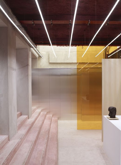
If you want to change your colour often, or want to move it around your home you can make coloured panels. You can even paint them on both sides, or use different materials to play with texture in your interior at the same time. If you make panels out of fabric, this will also improve the acoustics in your room. You can also use a semi transparent material, this gives an extra dimension when the light shines on it. And you can use them to separate parts of your room, without blocking the view.


coloured panels with a painted wall / found on zilverblauw pinterest
coloured separation panel / found on ffffound.com
a transparent colour accent / found on beautifuldecay.com


Happy walls
Add some confetti or fringes to make a happy wall.... it is such a wall that makes you smile every time you pass it! A good way to start you day or make you instantly happy when you get back from work.
  
a paper fringes wall, gives such a happy vibe / found on ohjoy.com
copper foil confetti / found on ohhhmhhh.de


Hopefully we gave you enough inspiration to create your own great wall. If you need more inspiration, you can always follow our pinterest board on walls. Do you need some more colour tips? You can check our post on pastel colours or our post on intense, dark colours (written in Dutch) We did a post on spicing up your walls before, so for more ideas check this post